Archive for the ‘typography’ Tag
The Destiny of the Rupee

“See, this country, in its days of greatness, when it was the richest nation on earth, was like a zoo. A clean, well-kept, orderly zoo. Everyone in his place, everyone happy. Goldsmiths here. Cowherds here. Landlords there. The man a called Halwai made sweets. The man called a cowherd tended cows. The untouchable cleaned faeces…
… in the old days there were one thousand castes and destinies in India. These days, there are just two castes: Men with Big Bellies, and Men with Small Bellies.”
The White Tiger by Aravind Adiga.

Indian school via Mad Decent.
India, to the best of my limited knowledge, is a country built on codes and glimmering with symbols – however prismatic.
Soon there will be a new symbol. And it’s already caused some division.
The Indian government has launched a public competition to design a currency symbol for the Rupee. Entrants must be Indian nationals and are required to supply a bank draft of Rs 500 with their applications by 15 April 2009.
From what I’ve read, Indian designers are peeved they have to pay the government to participate. But there’s already spec work up on ‘the internet’.

Indian Rupee spec design by Christian Büning; Design of the Euro.
Erik Spiekermann, founder of FontShop, is “afraid their brief is a little off”. Check out the discussions at Fontblog (in German) and TypeOff.
All the hubbub set me off on a dig. Beyond the obvious (£ Pound/ $ Dollar/ € Euro/ ¥ Yen), I had no idea which currencies bear their own symbol.
Do you?
Here are a few you might not have known:

Left to right:
Yuan Renminbi (China), Colón (Costa Rica), Rial (Iran), New Sheqel (Israel), Won (South Korea), Naira (Nigeria), Baht (Thailand).
So apart from China, none of the BRIC economies have their own currency symbol. Although Russia’s been searching since 1999.
The majority of nations in South America and the Caribbean bear the $ symbol.
What does any of this mean? Will a new symbol for the Rupee help transform India’s destiny into that of a “nation with Big Bellies”?
And should designers be paying for their crowdsourced work to compete?
Currency symbols elsewhere:
– World Currency Symbols index.
– The story of the Euro Symbol: From Logo to Letter.
– Bankface? Remixing bank notes.
The Aura of Type: Swissified
Objectified by Selectism on Vimeo.
Gary Hustwit’s second feature gets its world premiere next month.
Here’s the official blurb:
“Objectified is a feature-length documentary about our relationship to manufactured objects and, by extension, the people who design them… It’s about personal expression, identity, consumerism, and sustainability.”

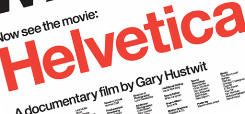
His debut, Helvetica, examined the proliferation of the world’s most loved (loathed?) typeface. Pundits showed a mixture of reverence and disdain.
That film could be the end of an aura.
I keep thinking about Walter Benjamin in this new age of mechanical reproduction. When repro is at the amateur’s fingertips, how can the aura of quality – or authenticity – transmit itself?
Credit to Anyone Can Swiss for hitting the question head on with their patented “Swissification” technology – an automated Helvetica poster generator.
Built in Dan Eatock‘s modish Indexhibit, Anyone Can Swiss throws Helvetica to the amateur with a guarantee of 100% satisfaction. Ha ha!
Here’s a video of their submissions from 4 February:
Left me with a hankering for more typefaces and sent me at a tangent.
Shouldn’t copywriters be trained in typography?
Typefaces are central to the “unique existence” of words. I don’t see why we’re forced to separate the content and the form.
It will only make the work more reproduceable.
Previous type chatter:
Readers Pop Your Retinas
I love this experimental type by Mexican graphic designer Manolo Guerrero (via).
“Optica Normal is not very normal,” say your tricked eyes. Rightly so.
Manolo G build this type with orthogonal lines. It’s designed for 100+ pt size – check the PDF sample.
Inspiration came from the abstract geometry of Colombian op artist Omar Rayo. There’s a nice website for the Museo Rayo and you can take a virtual tour of it here.
How can it feel so good to hurt your eyes this bad? My retinas must have a mind of their own.
Previous geometry:
– The genius of Andy Gilmore
– Olympic op art: Mexico 68
For $57 – Change
I can’t help but feel optimistic this morning, and I’m hopeful – with the biggest turnout in US election history – that we have a new, engaged generation.
Obama’s arrival will come to symbolise far more than the erection of a new American idol. Watching the crowds celebrate, I felt a bigger, richer sense of people coming together. The victory is theirs.
I hope we’ll continue to witness that joy and humanity on the streets.
There’s a short film that’s doing the rounds now (via BOOOOOOOM!) that seems all the more timely. Shot entirely on mobile phone, on the streets of Sydney and New York:
Mankind is No Island, by Jason van Genderen (director), Shane Emmett (producer) and John Roy (music composer) won Best Film at Tropfest NY 2008. The story created from found signage, beating 100 submissions from around the world, cost just $57 to make.
Small change. But we can all make small changes. That’s how a big change will happen.
What A Lovely Dress
These little outfits are, in order, Structurosa Script, Xtrude, Letra Libre and Brikd.
All are fonts designed by real-life, non-naked people using FontStruct. A real doll of a site. (via Slashdot.)
I’m prettying up a beautiful Q for the new Chester Draws typeface. Anyone else had a crack at making their own font?
Want to share?
 Comments (9)


 RSS Feed


